The Language of Touch: How Japanese Designers Choose Fabrics That Speak Before They Are Seen
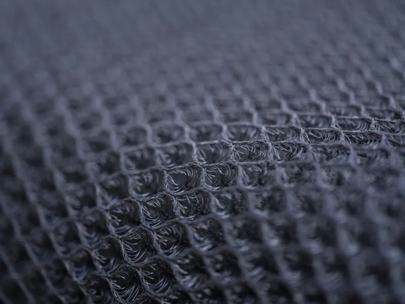
The swatch arrives wrapped in tissue paper. It is, at first glance, unremarkable—a pale gray rectangle of woven cloth, perhaps six inches square, without surface texture or visible pattern. A casual observer might set it aside.
The designer does not set it aside. She holds it between her palms for several seconds, feeling for the weight distribution—whether it settles evenly or pulls toward one edge. She draws it slowly across her wrist, noting the temperature it takes from her skin. She holds it against the window and watches how the winter light moves through the weave: not the color of the light, but its direction, the way certain threads catch it and others deflect it, producing a depth that is entirely invisible in the flat overhead fluorescence of a trade show floor.
This evaluation has taken less than a minute. The designer has already decided.
The Hierarchy of Perception in Japanese Textile Culture
In the broader Western fashion industry, fabric selection has traditionally been organized around the visual. Color is assessed first, then pattern, then surface finish. Tactile qualities—hand feel, drape, weight—are considered secondary, evaluated after the eye has already formed an opinion.
Japanese luxury design, particularly as it has evolved through the postwar generation of Tokyo-based houses, operates on a different sensory hierarchy. Touch precedes sight. The qualities that distinguish an exceptional textile from a merely adequate one are, in this tradition, frequently invisible to the camera and imperceptible at a distance. They reveal themselves only through handling—and only to hands that have been trained, over years of deliberate attention, to notice them.
This approach has produced a textile culture of extraordinary depth. Japan's weaving regions—Nishijin in Kyoto for silk, Omi for linen, Shinshu for silk and wool blends, and the island of Amami Oshima for the uniquely dense tsumugi silk—have maintained production standards calibrated not to visual spectacle but to haptic refinement. The goal, in each case, is a fabric that rewards prolonged contact: one that improves against the body, that moves with rather than against its wearer, that ages in ways that are legible as quality rather than decay.
What the Hands Know
The specific qualities that Japanese designers evaluate when selecting textiles are worth examining in detail, because they correspond directly to the characteristics that distinguish genuinely exceptional garments from their more photogenic but less enduring counterparts.
Weight distribution and fall. A fabric's weight is not simply a matter of grams per square meter. It is a question of how that weight is distributed through the weave, and how the fabric responds to gravity when it is cut and constructed. A well-weighted textile falls cleanly from the shoulder and holds its line through movement without requiring the structural intervention of underlining or heavy interfacing. Japanese designers often refer to this quality as koshi—a kind of resilient firmness that allows a fabric to hold shape without stiffness. It is virtually impossible to assess from a photograph.
Thermal response. High-quality natural fibers respond to body temperature in ways that synthetics and lower-grade naturals do not. Fine merino wool or Habutae silk will warm quickly against the skin and regulate temperature across a range of conditions. Japanese textile producers working in these materials often describe the ideal as a fabric that seems to disappear on the body—one whose presence is felt as comfort rather than weight. This quality, sometimes called nurumeri in the context of silk, is among the first things experienced Ginza clients learn to recognize.
Light behavior within the weave. This is perhaps the most difficult quality to articulate, but it is among the most decisive for Japanese designers working at the highest level. The way light interacts with a woven textile is determined by the twist of the individual threads, the angle at which warp and weft are interlaced, and the finishing processes applied after weaving. A Nishijin silk, for instance, does not simply reflect light from its surface—it absorbs and redirects it through the depth of the weave, producing a luminosity that shifts with the angle of observation. This is distinct from sheen, which is a surface property. It is closer to what jewelers call life in a stone—an internal quality that cannot be replicated by coating or finishing.
The Education of the American Consumer
For much of the past two decades, the American luxury consumer's primary framework for evaluating textile quality has been brand recognition and price point. A coat from a recognized heritage house at a significant price was understood to be well-made, often without the buyer possessing the specific sensory vocabulary to verify that assessment independently.
This is changing. The growing American interest in Japanese luxury—accelerated by a generation of consumers who discovered Comme des Garçons, Issey Miyake, and Yohji Yamamoto through independent retailers and global online communities—has introduced a new framework for evaluation. These consumers are learning, often through direct exposure to exceptional pieces, to assess quality through touch and movement rather than through label and price alone.
The implications for the broader luxury market are significant. A consumer who can feel the difference between a properly weighted Japanese wool and a visually similar but structurally inferior alternative is a consumer who is no longer primarily dependent on brand authority as a quality signal. This is a more sophisticated buyer—and, in the long run, a more loyal one, because their loyalty is grounded in genuine discernment rather than in marketing.
Ginza boutiques that carry Japanese textile-forward collections have observed this shift directly. Associates report that American clients, particularly those making repeat visits, increasingly ask to handle pieces before viewing them at a distance—a behavioral reversal that would have been unusual a decade ago.
The Quiet Revolution in How Quality Is Felt
There is something almost philosophical in the Japanese approach to textile selection—a conviction that the most important qualities of a thing are those that reveal themselves gradually, through sustained attention, rather than those that announce themselves immediately. It is an aesthetic rooted in mono no aware, the bittersweet awareness of transience, and in the related sensibility of wabi, which finds beauty in the understated and the impermanent.
For American consumers accustomed to a market that privileges the immediately legible, engaging with this sensibility requires a genuine slowing down. It requires the willingness to hold a piece of cloth against the light for longer than feels efficient, to notice what it does under your hands before deciding what it looks like on a hanger.
Those who make that adjustment tend not to reverse it. Once you have learned to read the language of a textile—its weight, its warmth, its particular relationship with light—the louder vocabularies of surface decoration and seasonal novelty begin to seem, by comparison, rather limited. That is the education Ginza offers. And it is one that changes, quietly and permanently, how you see.